Thursday, April 12, 2018

Tuesday, April 11, 2017
Sergio Garcia captures his first major title at the 2017 Masters
In 1999, I went to the Byron Nelson Invitational golf tournament in Irving, TX and followed around a 19 year old golfer who was making his professional debut - Sergio Garcia. Just a month earlier, I had watched Sergio take home the Silver Cup at the Masters Tournament for having the lowest score of any amateur. At the time, I was only a few years older than Sergio himself and I was fascinated with the joy and youthful exuberance he brought to the game. In the first round of the Byron Nelson tournament, Sergio fired a 7 under par 63 and I immediately became a fan.
Later that year, the rest of the world saw the same excitement when Sergio battled Tiger Woods in the 1999 PGA Championship at Medinah Country Club outside of Chicago. Sergio came close to capturing his first major title that week, finishing in 2nd place behind Tiger. The golf world thought he would become a potential rival to Tiger similar to what Jack Nicklaus had with Tom Watson or Lee Trevino. No one at the time would have guessed that Sergio would come so close over the next 18 years finishing second 3 more times with 22 top 10 finishes and no major titles. He would win tournaments - 9 on the PGA Tour and 15 on the European Tour. He also became one of the key members of 8 European Ryder Cup Teams with an impressive 19-11-7 record.
I watched a large majority of the Masters this past weekend and saw a different Sergio. He seemed more focused, mature and calm. Not letting bogeys effect him the way it had in the past. Instead of fading when faced with adversity, he fought back to win his first major title.
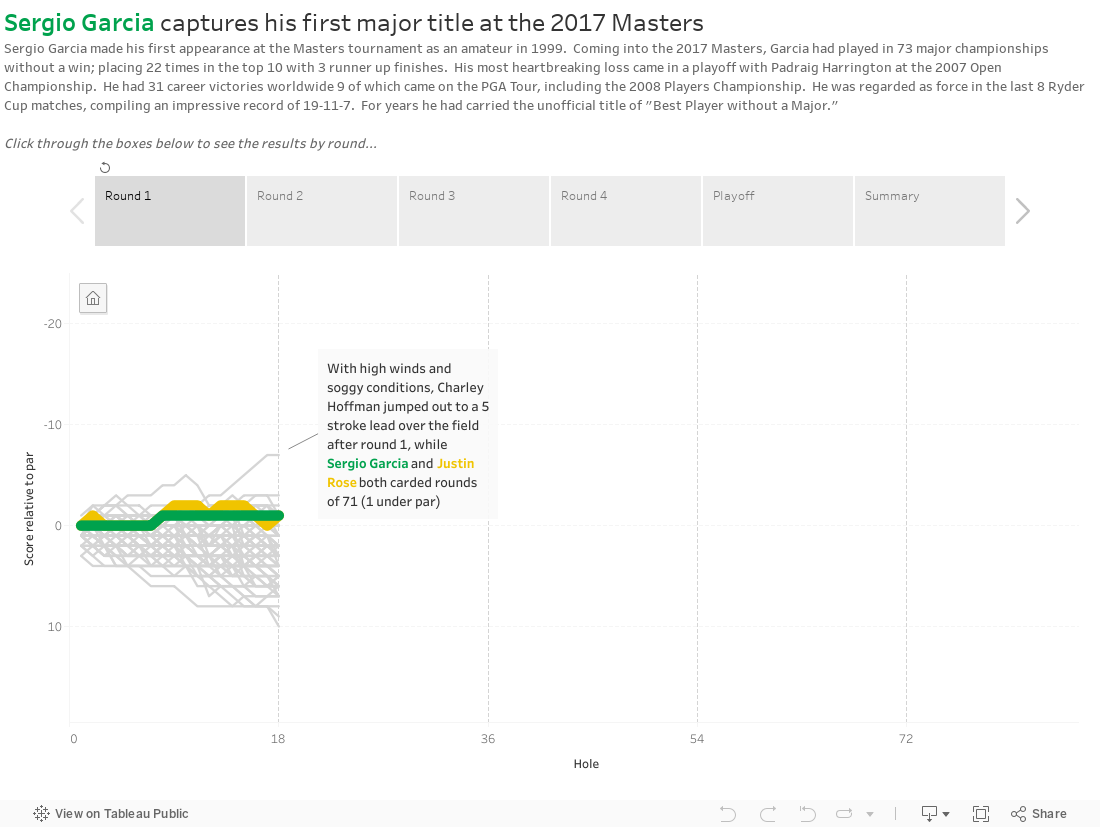
I created a similar visualization as part of a dashboard that I did after the 2015 Open Championship, but this time I wanted use it to tell the story of the 2017 Masters and his duel with Justin Rose.
Later that year, the rest of the world saw the same excitement when Sergio battled Tiger Woods in the 1999 PGA Championship at Medinah Country Club outside of Chicago. Sergio came close to capturing his first major title that week, finishing in 2nd place behind Tiger. The golf world thought he would become a potential rival to Tiger similar to what Jack Nicklaus had with Tom Watson or Lee Trevino. No one at the time would have guessed that Sergio would come so close over the next 18 years finishing second 3 more times with 22 top 10 finishes and no major titles. He would win tournaments - 9 on the PGA Tour and 15 on the European Tour. He also became one of the key members of 8 European Ryder Cup Teams with an impressive 19-11-7 record.
I watched a large majority of the Masters this past weekend and saw a different Sergio. He seemed more focused, mature and calm. Not letting bogeys effect him the way it had in the past. Instead of fading when faced with adversity, he fought back to win his first major title.
I created a similar visualization as part of a dashboard that I did after the 2015 Open Championship, but this time I wanted use it to tell the story of the 2017 Masters and his duel with Justin Rose.
Tuesday, March 28, 2017
Future Data Rockstar!
Last month my soon to be 9 year old daughter came home from school all excited about career day. This year they could dress up as what they wanted to be. I figured like most kids she would pick something like veterinarian, teacher, fire fighter, etc. Not Maggie, she declared that she wanted to be a Data Rockstar like Dad! I was so proud, but did she really know what a Data Rockstar does?

After we pulled together a super cool outfit with a custom Data Rockstar t-shirt, lanyard, Tableau Conference buttons and an awesome pair of glasses, we started talking about what data she might be interested in. I started showing her some of my previous visualizations and she landed on Deadpool. She asked, "Why did you have to make a viz about a movie I can't see? You should make one with kid-friendly movies."
So we started with a list of her favorite animated Disney movies and I started gathering data. I showed her how to drag Dimensions and Measures out to the view and every time something changed it was "Wow! That was cool!" Who knew data viz could be so much fun for a 3rd grader?
She had a blast building the views and choosing the colors - she went with Jewel Bright of course. Like any other kid, she loved the idea of a lollipop chart. I told her we could use Mickey icons instead of circles. That might have been her favorite part. That and the custom title image in Waltograph font. She said it made it feel like Disney ;)
My favorite part? We pulled in the weekly box office gross and she said it didn't look right. It was backwards from my Deadpool viz. So I explained what a Running Sum was and walked her through adding the table calculation. Not too many 3rd graders can rock a table calc!


After we pulled together a super cool outfit with a custom Data Rockstar t-shirt, lanyard, Tableau Conference buttons and an awesome pair of glasses, we started talking about what data she might be interested in. I started showing her some of my previous visualizations and she landed on Deadpool. She asked, "Why did you have to make a viz about a movie I can't see? You should make one with kid-friendly movies."
So we started with a list of her favorite animated Disney movies and I started gathering data. I showed her how to drag Dimensions and Measures out to the view and every time something changed it was "Wow! That was cool!" Who knew data viz could be so much fun for a 3rd grader?
She had a blast building the views and choosing the colors - she went with Jewel Bright of course. Like any other kid, she loved the idea of a lollipop chart. I told her we could use Mickey icons instead of circles. That might have been her favorite part. That and the custom title image in Waltograph font. She said it made it feel like Disney ;)
My favorite part? We pulled in the weekly box office gross and she said it didn't look right. It was backwards from my Deadpool viz. So I explained what a Running Sum was and walked her through adding the table calculation. Not too many 3rd graders can rock a table calc!

We ended up with what might be my favorite viz so far, because of how excited she was when it was finished.
Thursday, November 3, 2016
Tuesday, March 1, 2016
Deadpool's Performance at the Box Office
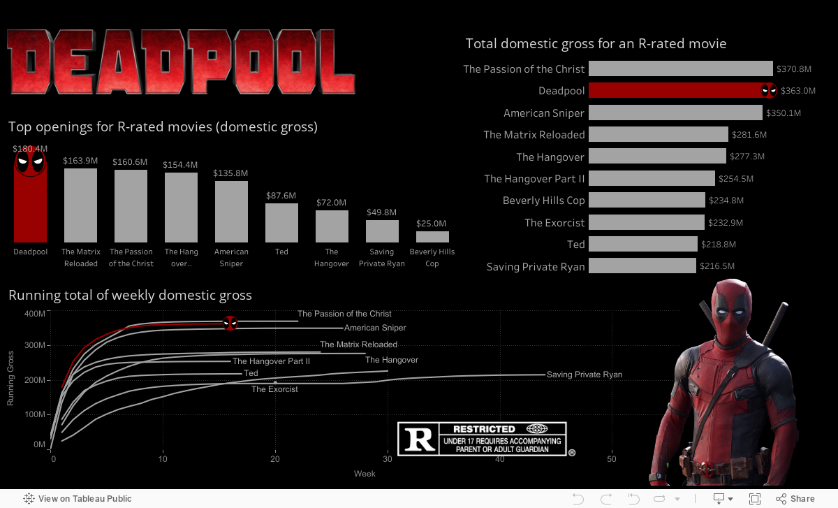
I went to the theater with a few buddies opening weekend to see Deadpool and I was shocked by how crowded it was. Sure it was Valentine's Day weekend, but still this was at 9pm and the theater was full. The following Monday I saw that the movie had the highest grossing opening weekend ever for an R-rated movie. So I thought I would head over to Box Office Mojo and take a look at the numbers.
By the way, this movie really earned its R-rating. Don't get me wrong, I enjoyed the movie, but it is definitely NOT suitable for kids.
By the way, this movie really earned its R-rating. Don't get me wrong, I enjoyed the movie, but it is definitely NOT suitable for kids.
Friday, October 30, 2015
Golfers who have reached #1 in the Official World Golf Rankings
The Official World Golf Rankings were established in 1986 to measure performance of professional golfers. These rankings change weekly and are based on tournament results from the previous 2 years. Certain tournaments such as the Major championships (Masters, US Open, Open Championship, and PGA Championship) and the four World Golf Championships use the rankings to determine which players are automatically qualified to enter the events.
For the first 10 years of the OWGR, there were only 7 different golfers who held the title of World #1. The next 15 years brought forth the age of Tiger Woods. During a 12 year period from 1998 to 2010, Tiger was the world #1 90% of the time.
Since 2010, there have been 8 different golfers (including Tiger for a 7 week span). This season there have been 7 changes in the #1 spot and the mantle has been passed to the new "Big 3" golfers in the sport - Rory McIlroy, Jordan Spieth, and Jason Day - all under the age of 30.
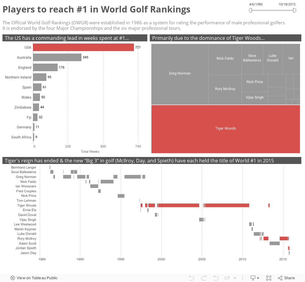
For the first 10 years of the OWGR, there were only 7 different golfers who held the title of World #1. The next 15 years brought forth the age of Tiger Woods. During a 12 year period from 1998 to 2010, Tiger was the world #1 90% of the time.
Since 2010, there have been 8 different golfers (including Tiger for a 7 week span). This season there have been 7 changes in the #1 spot and the mantle has been passed to the new "Big 3" golfers in the sport - Rory McIlroy, Jordan Spieth, and Jason Day - all under the age of 30.
Monday, October 26, 2015
What can a dog teach you about data?
I just got back from last week's Tableau Conference after spending a few extra days in Las Vegas. What an amazing week! This was my second conference and I can't wait until next year when the conference will be coming to Austin, Texas.
As I met people at conference, I shared my Tableau journey over the last year. How I went to conference in Seattle without ever using the tool, taking 2 days of training, and starting this blog the day I came home. It has been an exciting year, and I have come a learned so much, but hands down the most rewarding experience was when I was asked to present about data at my son's school.
Sharing this with people over the last week, many of them commented on my example of using a dog to teach 10 year kids about the different types of data. I was even mentioned by Tableau Zen Master Peter Gilks on his blog post of thoughts from conference. Some people thought that this analogy was a great tool to explain to their own children what they do everyday while others mentioned that it was a great way to educate their management on data types.
So how can we use a dog to learn about data? Well as most of you know, data can be classified as either qualitative or quantitative. Since my audience was a group of elementary students, I looked for a way to keep the definitions simple and easy to remember.
Taking it one step further, there are two types of quantitative data - discrete and continuous. I will admit that when I first started using Tableau, I struggled with this until I started thinking about it in the following terms:
It was so fulfilling to see these kids get excited about data! One of the teachers even sent me an email the next day to tell me that the students had Chromebooks in class and they all wanted to build visualizations. Future Data Rockstars!

As I met people at conference, I shared my Tableau journey over the last year. How I went to conference in Seattle without ever using the tool, taking 2 days of training, and starting this blog the day I came home. It has been an exciting year, and I have come a learned so much, but hands down the most rewarding experience was when I was asked to present about data at my son's school.
Sharing this with people over the last week, many of them commented on my example of using a dog to teach 10 year kids about the different types of data. I was even mentioned by Tableau Zen Master Peter Gilks on his blog post of thoughts from conference. Some people thought that this analogy was a great tool to explain to their own children what they do everyday while others mentioned that it was a great way to educate their management on data types.
So how can we use a dog to learn about data? Well as most of you know, data can be classified as either qualitative or quantitative. Since my audience was a group of elementary students, I looked for a way to keep the definitions simple and easy to remember.
- Qualitative - data that is descriptive, and does not measure things
- Quantitative - data that is used to measure and can be written down in numbers
Taking it one step further, there are two types of quantitative data - discrete and continuous. I will admit that when I first started using Tableau, I struggled with this until I started thinking about it in the following terms:
- Discrete - whole numbers or items that can be counted
- Continuous - numbers within a range or can be measured
- What is something qualitative about Data?
- He is brown and white
- He has a red collar
- He has lots of energy
- He is friendly
- How about something quantitative that is discrete?
- He has 4 legs
- He has 2 eyes
- Or something continuous?
- He weighs 14.5 pounds
- He is 3 years old
- Can you combine qualitative and quantitative to describe him?
- He has 2 (discrete) brown ears (qualitative)
It was so fulfilling to see these kids get excited about data! One of the teachers even sent me an email the next day to tell me that the students had Chromebooks in class and they all wanted to build visualizations. Future Data Rockstars!

Tuesday, July 21, 2015
2015 Open Championship
I really enjoyed watching the Open Championship this year at the birthplace of golf - The Old Course at St. Andrews. By the final day there were 20 players within 2-3 shots of the lead at any given time.
I quickly threw together a visualization of the leaderboard and tried to model it after the style of the iconic yellow scoreboards at the tournament.
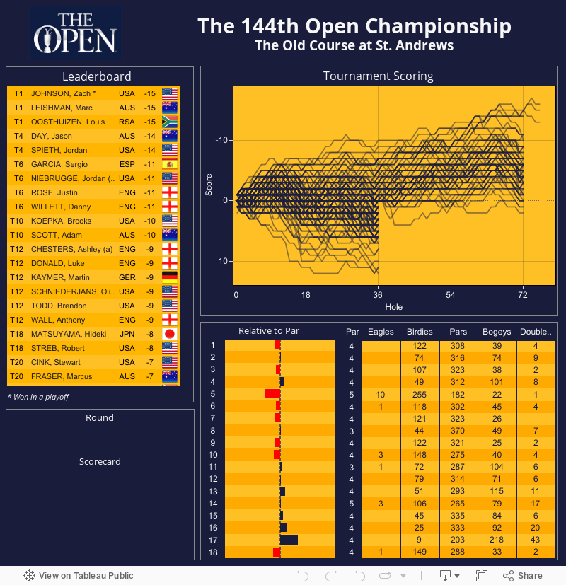
I quickly threw together a visualization of the leaderboard and tried to model it after the style of the iconic yellow scoreboards at the tournament.
Tuesday, June 9, 2015
Junior Golf Tournament Results
One year ago today, my son entered his first golf tournament. He had decided to give up baseball and pursue a new sport - golf. I love both golf and baseball, and enjoyed coaching him and many other kids in baseball over the years. I have to admit though, this past year has been so much fun for the two of us. He has participated in 24 tournaments and made huge improvements. I am so proud of his hard work, drive, and passion for the game.
To show him how much he has improved over the last year, I decided to create a Tableau viz. He started out playing in 5 hole tournaments and progressed to 9 holes as his scored improved. To adjust for the different scores, I extrapolated the 5 hole scores to 9 holes and added 3 strokes to adjust for the added length of the course.
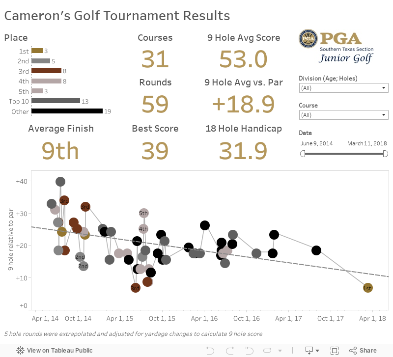
To show him how much he has improved over the last year, I decided to create a Tableau viz. He started out playing in 5 hole tournaments and progressed to 9 holes as his scored improved. To adjust for the different scores, I extrapolated the 5 hole scores to 9 holes and added 3 strokes to adjust for the added length of the course.
Friday, May 15, 2015
4th Grade Survey
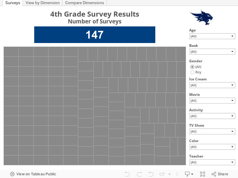
I was asked to do a presentation at my son's school for Career Week on analytics and data visualization. As part of the presentation, I asked the kids to complete a survey with their favorite color, movie, TV show, book, etc. I then created the following dashboard in Tableau for us to visualize the results.
For the kids in the presentation here is the link I promised to the Pokemon visualization created by Jewel Loree
For the kids in the presentation here is the link I promised to the Pokemon visualization created by Jewel Loree
Saturday, March 7, 2015
How Good is Mike Trout?
As a baseball fan and a data guy, I have followed some of the blogs on Fangraphs, but I didn't realize that there was a query tool for statistics. Wow. What an awesome resource.
I started downloading some data and thought I would take a look at how good Mike Trout has been in his young career.
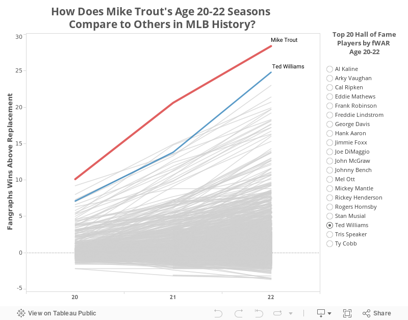
I started downloading some data and thought I would take a look at how good Mike Trout has been in his young career.
Monday, February 23, 2015
Which MLB Teams Have the Most Luck?
The Pythagorean Expectation was developed in the 1980s by legendary baseball statistician Bill James. The formula is used to determine the number of games a team "should" have won based upon the number of runs scored and allowed. He originally used an exponent of 2, which has been revised over the years to the current 1.83.
Teams who outperform their Pythagorean expectation are generally perceived as "lucky" and those who under perform are considered "unlucky." This viz allows you to take a look at which teams are lucky or unlucky over the years.

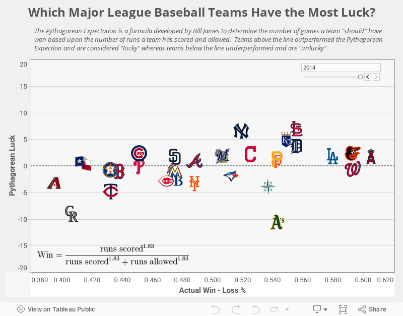
Teams who outperform their Pythagorean expectation are generally perceived as "lucky" and those who under perform are considered "unlucky." This viz allows you to take a look at which teams are lucky or unlucky over the years.
Tuesday, February 17, 2015
MLB Franchise Performance
I always look forward to this time of year waiting to hear the phrase "Pitchers and catchers are reporting to Spring Training this week."
I love baseball and especially baseball history, so I wanted to focus a visualization on the past performance of MLB franchise performance. I have also wanted to try a "small multiples" visualization. I love the look of the NBA BALLCODE visualization by Peter Gilks over at Paint By Numbers, so I thought I would try something similar.
The viz below shows the performance of MLB franchises using games above/below .500. You can use the sliders to go back to the 1870's, but I decided to focus primarily on the Expansion Era beginning in 1961. I felt this was a good starting point since 4 teams were added over 2 years: Angels, Astros, Mets, and the new Senators (after the previous Senators became the Minnesota Twins). The league also expanded the number of games from 154 to the current 162.
I also wanted to add another dimension to the data, so I decided to change the team color to gold in seasons when the team won the World Series. This adds a good perspective to teams like the Yankees (especially if you move the slider back to the 1920s) and the Marlins (only 6 winning season, but 2 World Series titles).
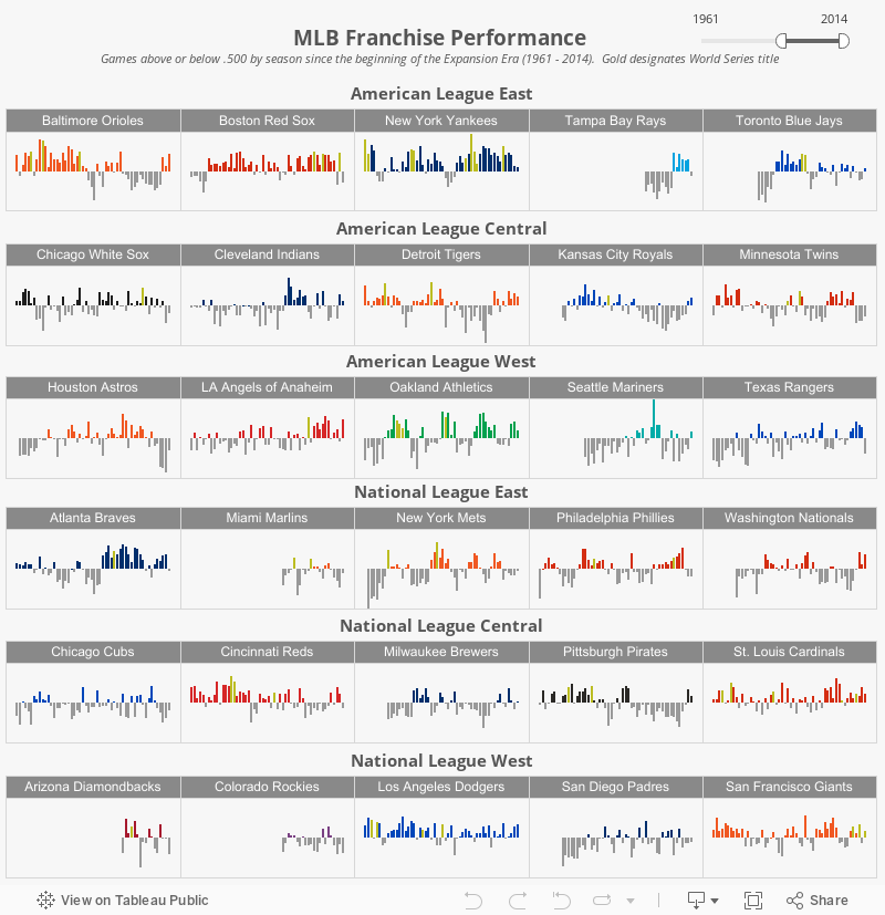
I love baseball and especially baseball history, so I wanted to focus a visualization on the past performance of MLB franchise performance. I have also wanted to try a "small multiples" visualization. I love the look of the NBA BALLCODE visualization by Peter Gilks over at Paint By Numbers, so I thought I would try something similar.
The viz below shows the performance of MLB franchises using games above/below .500. You can use the sliders to go back to the 1870's, but I decided to focus primarily on the Expansion Era beginning in 1961. I felt this was a good starting point since 4 teams were added over 2 years: Angels, Astros, Mets, and the new Senators (after the previous Senators became the Minnesota Twins). The league also expanded the number of games from 154 to the current 162.
I also wanted to add another dimension to the data, so I decided to change the team color to gold in seasons when the team won the World Series. This adds a good perspective to teams like the Yankees (especially if you move the slider back to the 1920s) and the Marlins (only 6 winning season, but 2 World Series titles).
Wednesday, February 11, 2015
2014 PGA Tour Average Proximity
I was inspired to tackle this chart after stumbling across a radial bar chart on the InterWorks Tableau blog. I figured proximity to the hole was the perfect application for this type of chart.
I had to complete the custom SQL from a full version of Tableau, then extract the results into a spreadsheet to upload them to Tableau Public. Other than that the rest was fairly straightforward using the calculations in the InterWorks blog
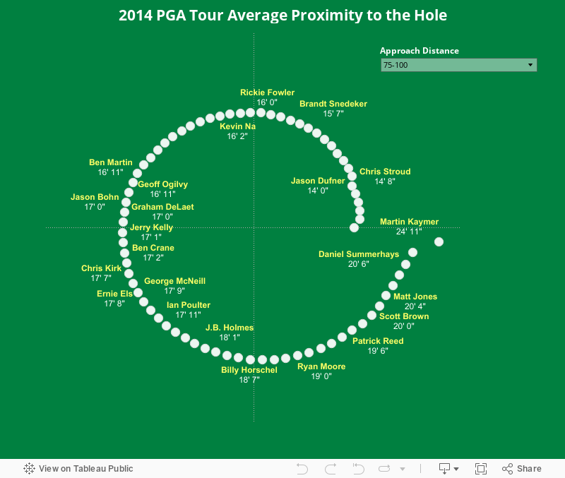
I had to complete the custom SQL from a full version of Tableau, then extract the results into a spreadsheet to upload them to Tableau Public. Other than that the rest was fairly straightforward using the calculations in the InterWorks blog
Friday, October 3, 2014
2014 PGA Tour Driving Accuracy vs. Distance
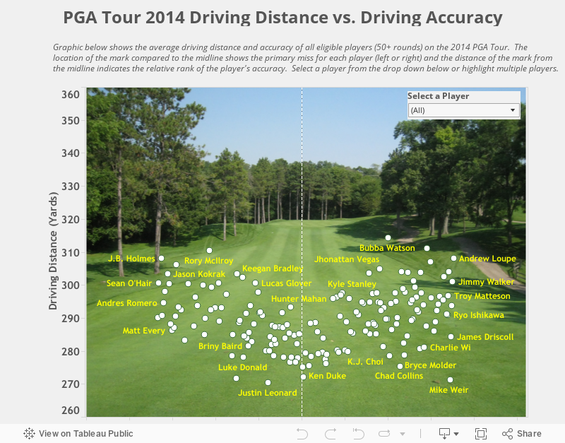
For this viz I wanted to compare driving accuracy with driving distance on the PGA Tour. I could have done a normal scatter plot with each measure on an axis and add a trend line, but I wanted something different.
In my dataset I not only had accuracy, I also had the percentage of misses left and right. I wanted to try and figure out a way to visualize that as well.
As players hit it farther on average they move farther away from the center line, whereas the shorter hitters tend to be more in the middle of the fairway. The distribution pattern looks similar to the letter 'V' or 'U'. The biggest outlier appears to be Mike Weir, who at this point in his career is a pretty poor driver of the ball. He ranked 172nd in accuracy and 176th is distance.
In my dataset I not only had accuracy, I also had the percentage of misses left and right. I wanted to try and figure out a way to visualize that as well.
As players hit it farther on average they move farther away from the center line, whereas the shorter hitters tend to be more in the middle of the fairway. The distribution pattern looks similar to the letter 'V' or 'U'. The biggest outlier appears to be Mike Weir, who at this point in his career is a pretty poor driver of the ball. He ranked 172nd in accuracy and 176th is distance.
Friday, September 26, 2014
The Impact of Technology on PGA Tour Driving Distance
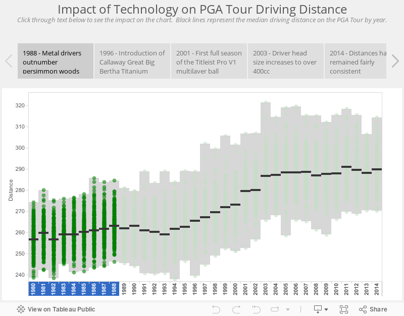
For this viz I really wanted to find something I could show using story points in Tableau. I started looking at stats on the PGA Tour website and noticed that they had historical stats going back to 1980. That year, the leader on Tour was Dan Pohl at 274 yards. On today's Tour that would place 174th place, 40 yards behind the leaders!
What was the biggest contributor? Workout regimens have surely played a role as players are more dedicated to fitness and strength training, but Gary Player may have been the biggest workout fanatic in the history of the tour, and he never averaged 300+ yards off the tee.
The obvious answer is advancement in equipment.
In 1980, players were using 43.5" persimmon drivers with steel shafts and balata balls. Todays drivers heads are nearly twice the size of persimmon, made of titanium, and have 45" graphite shafts. Not to mention the technology of today's multi-layer balls.
What advancement in equipment had the biggest impact?
There were two major advancements that contributed to the biggest change. And they both occured within a 4 year span (2000-2003). The first was the introduction of the multi-layer ball (Titleist Pro V1) and the second was the increase in driver head size to over 400cc. The combination of these increased the median driving distance 5% or over 13 yards!
The increase in distance impacted players equally across the board. Corey Pavin has always been one of the shorter hitters on Tour (and happened to be one of my favorite golfers growing up). His average drive in 2000 was 258.1 yards. Just 4 seasons later in 2003 it jumped to 268.9 yards (an increase of 4.2%). At the other end of the spectrum is John Daly. Always one of the longest hitters on Tour, Daly went from 301.4 yards in 2000 to 314.3 yards in 2003 (an increase of 4.3%).
What was the biggest contributor? Workout regimens have surely played a role as players are more dedicated to fitness and strength training, but Gary Player may have been the biggest workout fanatic in the history of the tour, and he never averaged 300+ yards off the tee.
The obvious answer is advancement in equipment.
In 1980, players were using 43.5" persimmon drivers with steel shafts and balata balls. Todays drivers heads are nearly twice the size of persimmon, made of titanium, and have 45" graphite shafts. Not to mention the technology of today's multi-layer balls.
What advancement in equipment had the biggest impact?
There were two major advancements that contributed to the biggest change. And they both occured within a 4 year span (2000-2003). The first was the introduction of the multi-layer ball (Titleist Pro V1) and the second was the increase in driver head size to over 400cc. The combination of these increased the median driving distance 5% or over 13 yards!
The increase in distance impacted players equally across the board. Corey Pavin has always been one of the shorter hitters on Tour (and happened to be one of my favorite golfers growing up). His average drive in 2000 was 258.1 yards. Just 4 seasons later in 2003 it jumped to 268.9 yards (an increase of 4.2%). At the other end of the spectrum is John Daly. Always one of the longest hitters on Tour, Daly went from 301.4 yards in 2000 to 314.3 yards in 2003 (an increase of 4.3%).
Friday, September 19, 2014
Top 25 PGA Tour Players
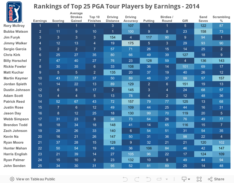
Since the PGA Tour season wrapped up, I thought I would take a look at the top 25 players on the money list through the end of the regular season and see how they ranked in key categories.
A couple of things really jumped out when you look at the heat map below. Jimmy Walker has the worst Driving Accuracy on tour, yet finished 4th on the money list due to 3 wins early in the season and his strong putting.
In fact, driving accuracy as a whole doesn't appear to be too important in regards to success on the PGA Tour, unless your name is Jim Furyk.
Furyk is one of the shortest hitters on the Tour and not a very good putter at this point in his career. However, he is one the the best ball strikers on tour, both off the tee and from the fairway. He also has one of the best short games with the fewest bogeys per round on tour.
A couple of things really jumped out when you look at the heat map below. Jimmy Walker has the worst Driving Accuracy on tour, yet finished 4th on the money list due to 3 wins early in the season and his strong putting.
In fact, driving accuracy as a whole doesn't appear to be too important in regards to success on the PGA Tour, unless your name is Jim Furyk.
Furyk is one of the shortest hitters on the Tour and not a very good putter at this point in his career. However, he is one the the best ball strikers on tour, both off the tee and from the fairway. He also has one of the best short games with the fewest bogeys per round on tour.
Sunday, September 14, 2014
Ryder Cup
I recently starting using Tableau as a data visualization tool for work and just got back from the 2014 Tableau Conference. It was such an awesome week and I walked away with so many ideas. My favorite session was one on finding cool data and starting your own data blog. Big thanks to Jewel Loree from Tableau Public who hosted the session. Check out her awesome blog and vizzes here. It inspired me to start my own blog and share some of my ideas with the world outside of work.
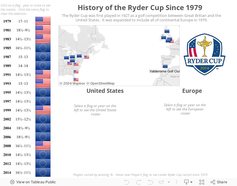
Since I love golf, I thought I would make my first visualization one about the history of the upcoming Ryder Cup.
I am not sure yet how frequently I will be posting. It may just depend on time and when I get ideas or come across interesting data.
Here it is. My first viz...
Since I love golf, I thought I would make my first visualization one about the history of the upcoming Ryder Cup.
I am not sure yet how frequently I will be posting. It may just depend on time and when I get ideas or come across interesting data.
Here it is. My first viz...
Subscribe to:
Posts (Atom)